Intro
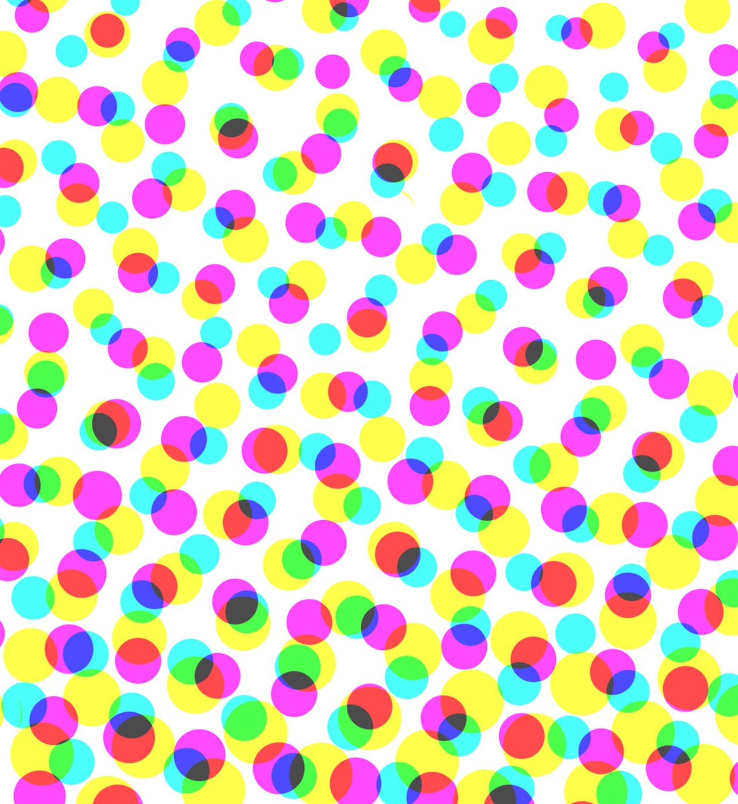
Halftone loading effect
Load images with a halftone loading shader effect. You can load them from the top, bottom, left or right directions and with different durations and timings.
And you can set the min and max circle sizes and whether the effect should scale with the viewport.
Demo
Effect on pageload
Or change the direction and trigger with a button
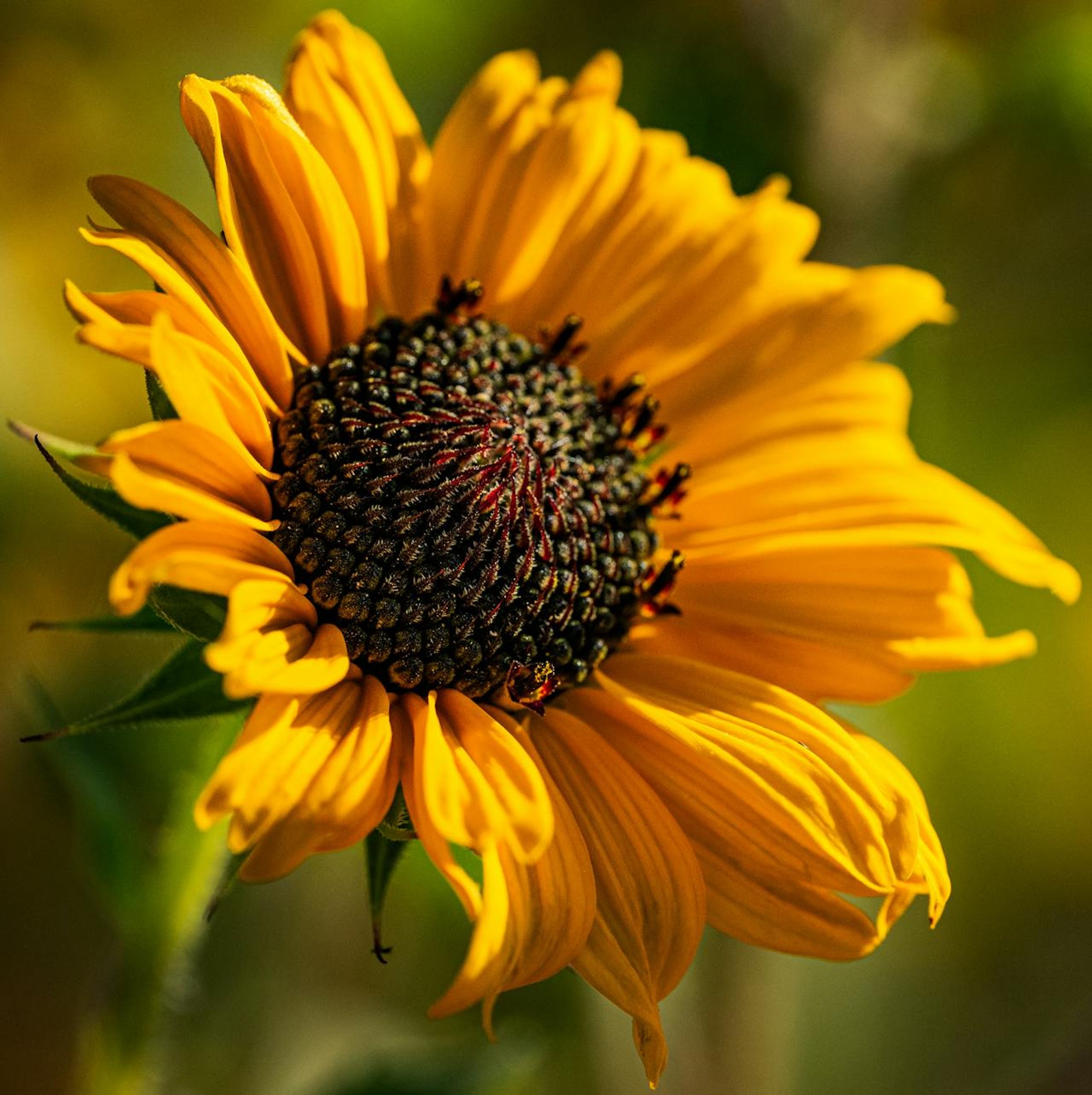
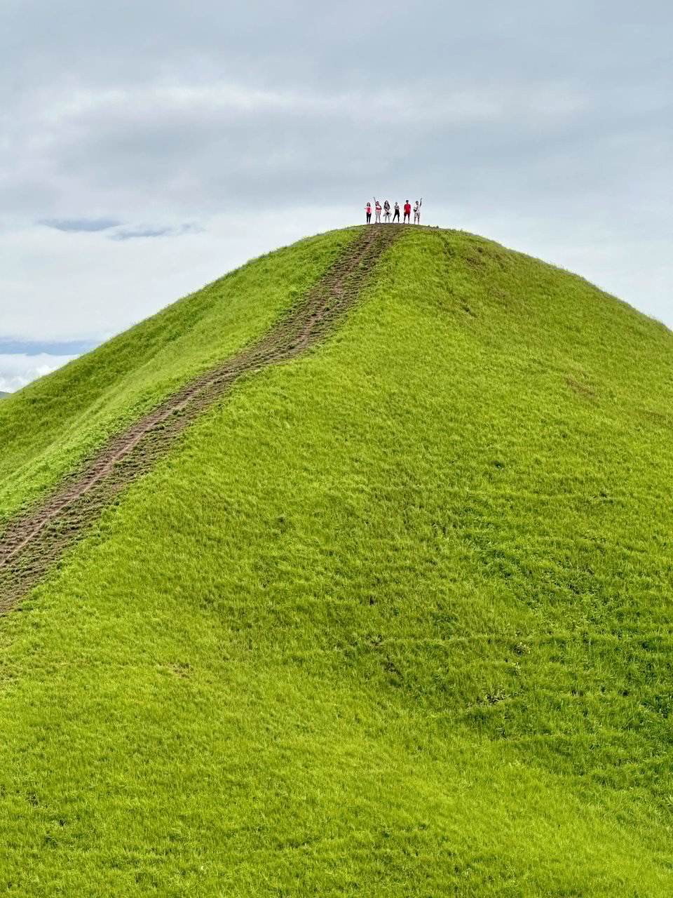
With some images the effects can get really interesting
Components
halftone-shader-loader
Attributes
alt-text Type: stringDescription:Alt text for imageanimation-delay Type: stringDefault:"0s"Description:How much delay is required before the animation starts. Can be set in seconds or miliseconds (e.g. "3.5s", "3500ms"). Can be also be set as a number, which will default to miliseconds.animation-duration Type: stringDefault:"5s"Description:How long the animation takes to complete. Can be set in seconds or miliseconds (e.g. "3.5s", "3500ms"). Can be also be set as a number, which will default to miliseconds.animation-timing Type: stringDefault:"ease"Description:The way the animation timing behaves. E.g. "ease-out", "cubic-bezier(0.4, 0, 0.2, 1)", "linear".direction Type: stringDefault:"up"Description:Set in which direction the effect animation moves. Options: "up", "down", "left" and "right".id Type: stringDefault:// Automatically generated if left empty.Description:Id for the component and its canvas.max-circle-size Type: numberDefault:25Description:Controls the maximum diameter of circles in the halftone pattern, measured in pixels.min-circle-size Type: numberDefault:1Description:Controls the minimum diameter of circles in the halftone pattern, measured in pixels.scale-with-view-port Type: booleanDefault:trueDescription:Controls whether circle sizes automatically adjust based on the screen/viewport width. When true (responsive) circle sizes scale proportionally with screen size. On a 1200px desktop, circles use your exact pixel values. On an 800px mobile device, circles scale down to approximately 67% of your specified sizes to maintain visual proportion.src Type: stringDescription:Src for the image upon which the effect is applied.trigger Type: booleanDefault:falseDescription:Controls when the halftone reveal animation starts and allows for on-demand triggering of the animation effect.Events
animationStarted Triggers when animation starts (so after animationDelay if delay is set). animationEnded Triggers when animation ends.
Inspired by Jean Mazouni Halftone Shader Effect.